The problem
Make buying handmade online feel as safe as buying it at the bazaar
Persian handmade work is everywhere, but finding it online usually means scrolling Instagram pages and hoping the seller is real. I wanted one place where buyers can trust what they're getting and makers can sell beyond their own city.
- Too much to sift throughBig online markets bury handmade work among mass-produced goods.
- Hard to trustPeople worry the product won't match the photos, so they don't buy.
- No time for the bazaarThe people who care most about crafts often can't get to markets.
- Makers stay invisibleArtisans have no shared shopfront where their story comes with their work.
Buyers
Show me real handmade work, and give me a reason to trust it.
Want unique pieces and good supplies, quickly.
Artisans
Give me a place to sell my work and tell my story.
Want to reach buyers outside their own city.
Research
I started with the person I was designing for
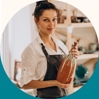
Meet Sara, and her empathy map
Sara, 32
- Job
- Interior designer, DIY enthusiast
- Lives in
- Tehran
She loves handmade pieces and wants to support local makers, but she's busy and doesn't trust buying online.
What she says, thinks, does and feels
Says
- "I wish there was an online store that truly captures Persian craftsmanship."
- "I'm so busy with work, I don't have time to visit markets."
Thinks
- I want my projects to stand out with handmade pieces.
- Finding reliable handmade products online is hard.
Does
- Searches online and follows Persian craft pages on social media.
- Hesitates to buy because of trust.
Feels
- Excited by unique finds.
- Overwhelmed by choice, anxious about quality.
Brand
A name, a mark and colours taken from the craft itself
One word, two meanings
In Persian, بوم means canvas, where every piece starts, and homeland, a home for local craft.
The logo
A pot of art tools inside a monitor: what's sold, and where. One line weight and one colour, so it still reads as a tiny browser icon.
Colours
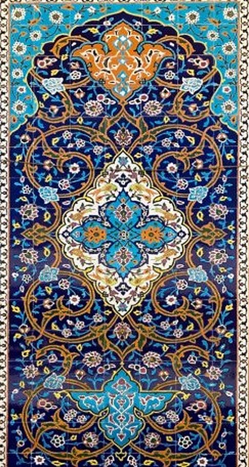
Taken from the bright colours of late Persian painting and tilework: turquoise as the main colour, warm clay as the second, grey for text, and three accents for labels and sales.
#17C1D7#CE9661#6C7F82#D5664F#1BA799#EE5C91Shapes
Two curved shapes from Iranian buildings, each with one job.
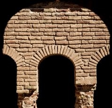
Archproduct photos, so mixed photos look like one set
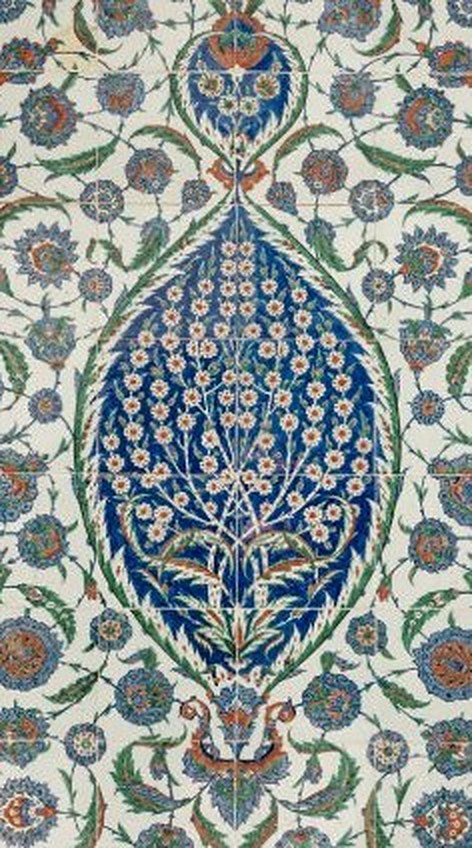
Leafcategories only, so they never look like products
UI kit
Before designing any pages, I turned the brand into a small UI kit in Figma so every screen would match. Type is Estedad, a typeface made for Persian, with prices in Persian numerals. The full kit opens below.
See the full UI kitHide the full UI kit
Colour scales
Ten steps for each colour. Step 05 is the main one.
Colour roles
What each colour is for, so pages use roles rather than raw steps.
- Page backgroundNeutral 09
- Header, forms, filtersSecondary 10
- Nav bar, primary buttonsPrimary 05
- Selected options, tagsPrimary 10
- Body text and titlesNeutral 01
- LinksPrimary 02
- Text on warm panelsSecondary 01
- Sale badgeAccent 2
Type scale
Desktop sizes, with the phone size where it changes.
Spacing
Radius
Shadow
Components
The parts the landing page and the shop pages are built from.
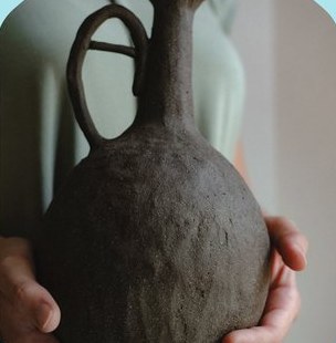
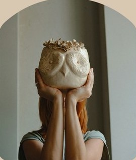
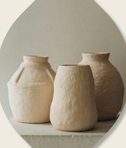
سفال لالجین، روی چرخ شکل گرفته.
بافت سفالش از عکس هم قشنگتر است.
Off screen
I also tried the brand on a bag, business cards, a mailer box and a gift tag, because that's what a buyer actually holds when an order arrives.
Design
How the research turned into a shop
From insights to sections
From Sara and the empathy map I pulled out seven insights, then turned each one into something on the page. Pick one to see where it went. Four are in the design, one is partly there, and two are for later.
Landing page structure, top to bottom
Sorting the products
I did a card sort by hand to turn a long product list into five groups, then gave each one a place on the site.
Handmade products
Home & decorationPainting & artworkFashion & accessoriesPersian artCraft supplies
Paints & brushesTextile & sewingDIY kitsMouldsArtisan profiles
Featured makersArtisan storiesInspiration
Persian design ideasDIY projectsShopping experience
CartCheckoutWishlist- Handmade productsCategory tiles, straight under the hero
- Craft suppliesAn "Art supplies" tile next to them
- Artisan profiles"Sell your products" in the main menu
- InspirationBlog and newsletter near the bottom
- Shopping helpCart and sign in at the top, buying guides at the bottom
The landing page, top to bottom
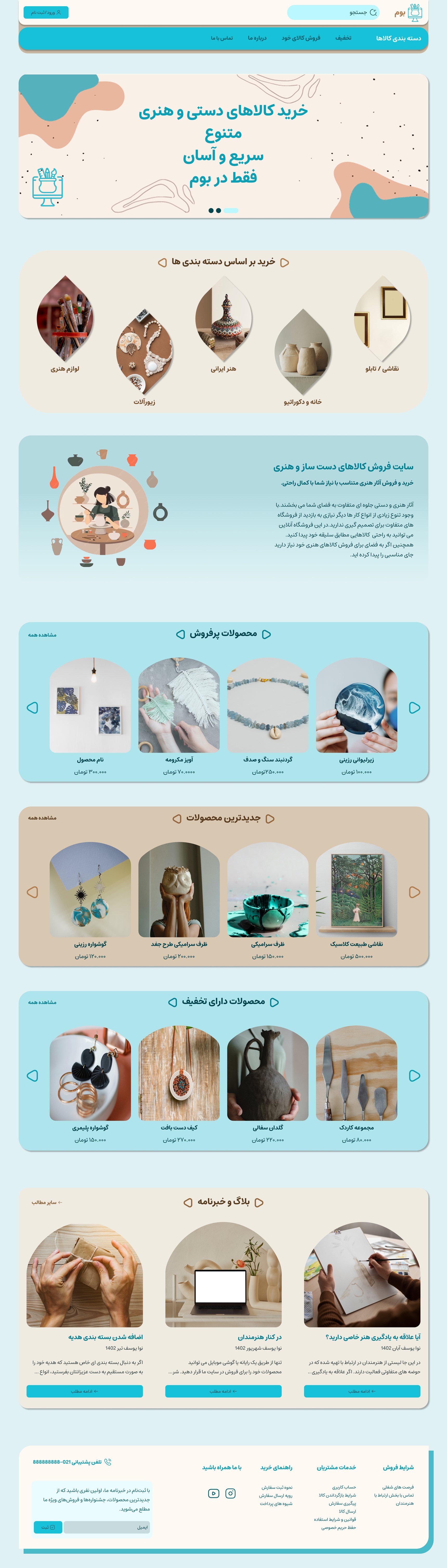 123
- 1
A way in for makers
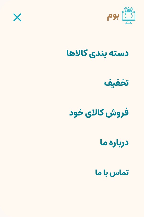
"Sell your products" sits in the main menu, so artisans can find how to join from any page.
- 2
Categories straight after the hero
Busy buyers see what the shop sells before they scroll through any products.
- 3
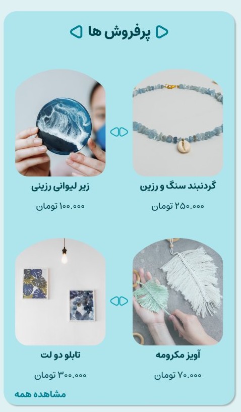
Shelves that switch colour
Bestsellers, newest and discounted alternate between turquoise and clay, so you can see where one ends. Bestsellers also help people who aren't sure yet.
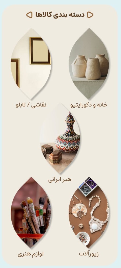
- 4
Grids on phones
Carousels become two-column grids, so four products show at once.
The pages after it
From the landing page, a buyer goes to a category to browse, a product to decide on, the maker behind it, and then checkout. I designed each one around a problem from the research.
Category page
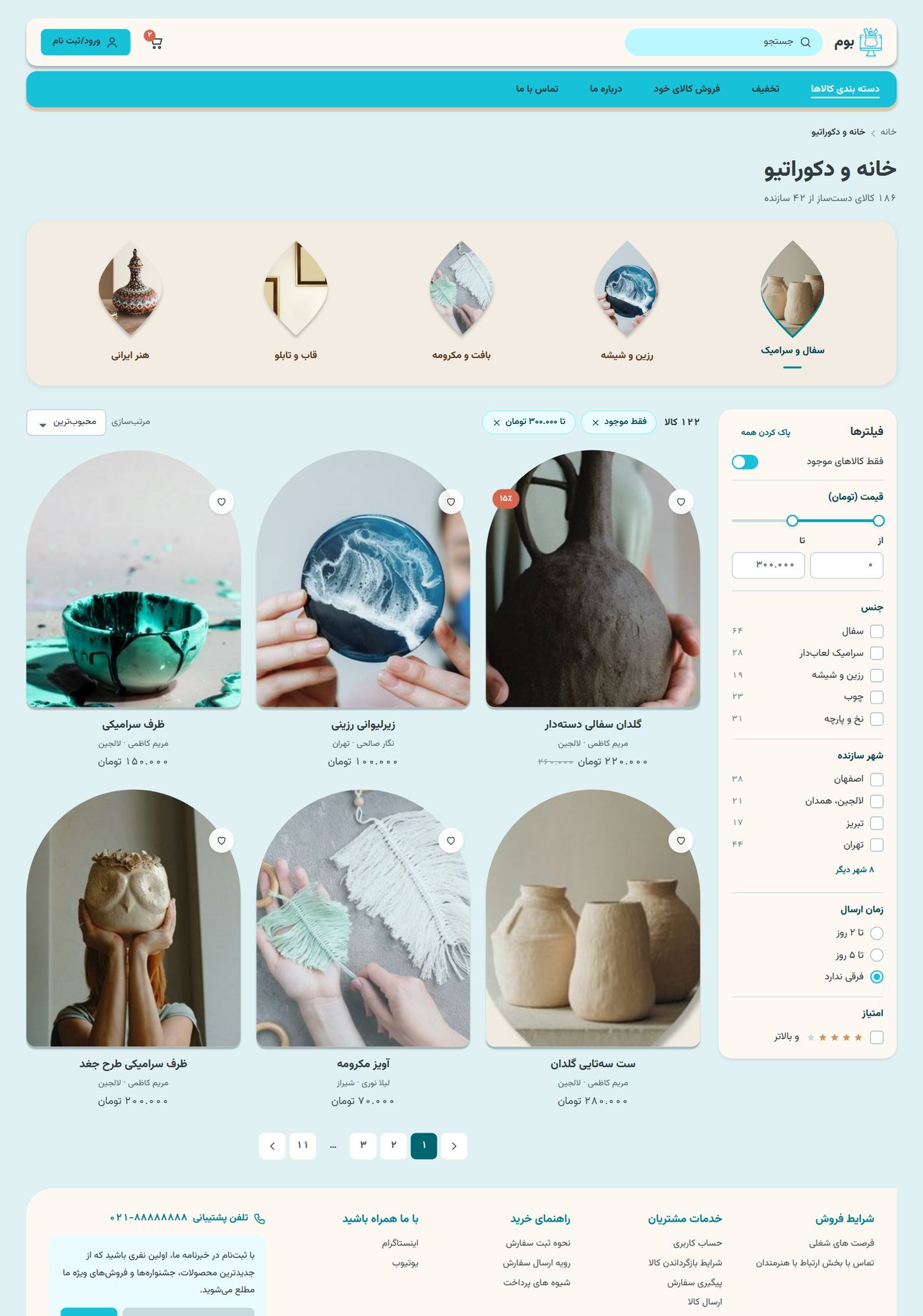
Where a buyer browses. Sara wants to find things fast and back local makers.
 123
- 1
Subcategories as leaves
The same leaf shape as the home page, so categories always look like categories.
- 2
Filters for handmade work
Material, the maker's city, delivery time and rating, next to stock and price.
- 3
The maker on every card
Each product shows who made it and where, so buyers can back local makers.
Product page
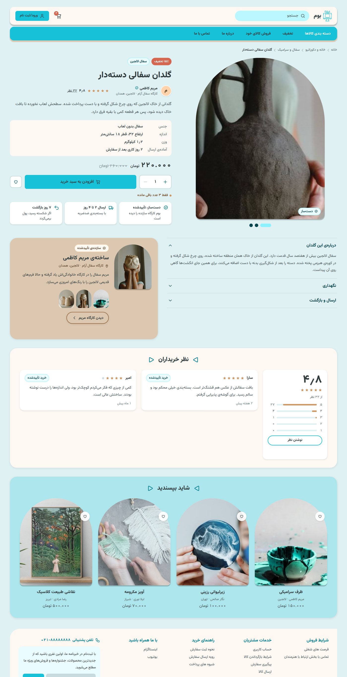
Where a buyer decides. Trust was the biggest worry in the research, so the proof sits next to the price.
 1234
- 1
Maker and a "handmade" tag by the title
You see who made it and where before anything else.
- 2
Three promises under the button
Handmade and checked, delivery in 2 to 4 days, and 7-day returns. The last photo also draws the real size.
- 3
About the maker
A short panel with their story, linking to their shopfront.
- 4
Verified reviews
Reviews from people who actually bought the piece are marked.
Maker profile
A shopfront for one maker, because artisans had nowhere to tell their story.
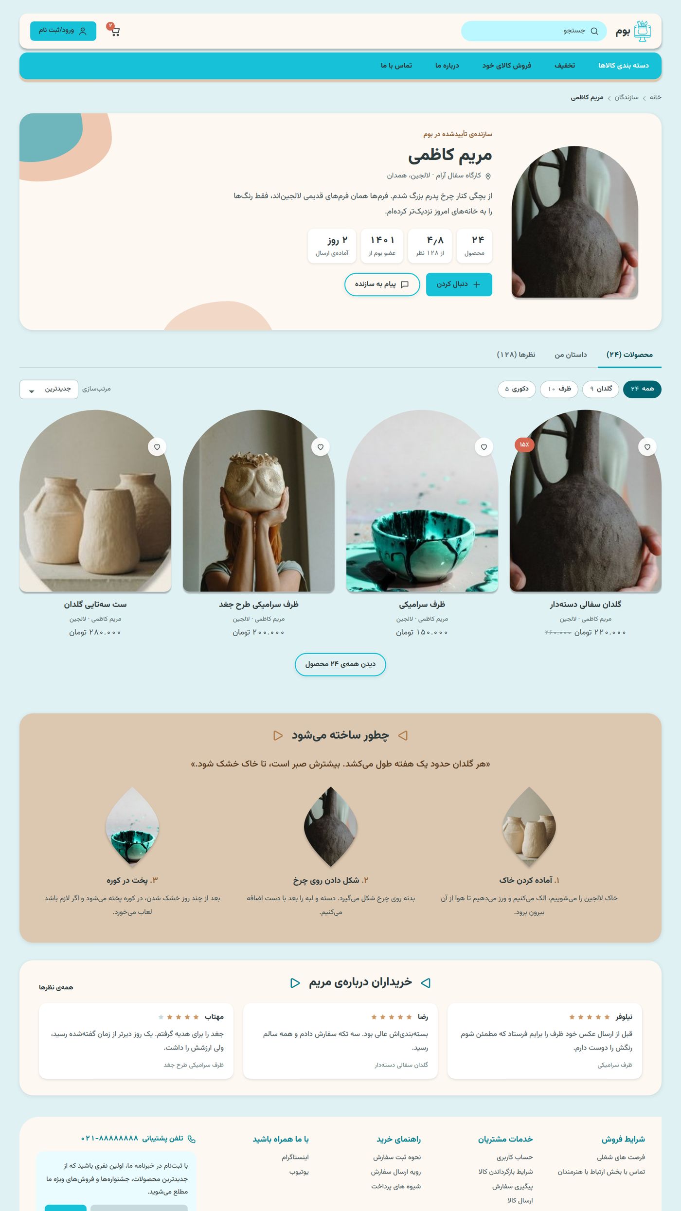 1234
- 1
Who they are
Workshop, city, a "verified maker" tag, and how fast they ship.
- 2
Their products
Filtered by type, so a big shop stays easy to browse.
- 3
How it's made
Three steps in their own words, the story buyers said they wanted.
- 4
What buyers say
Reviews about the maker, not just one product.
Checkout
Made for busy buyers: three steps, and no account needed.
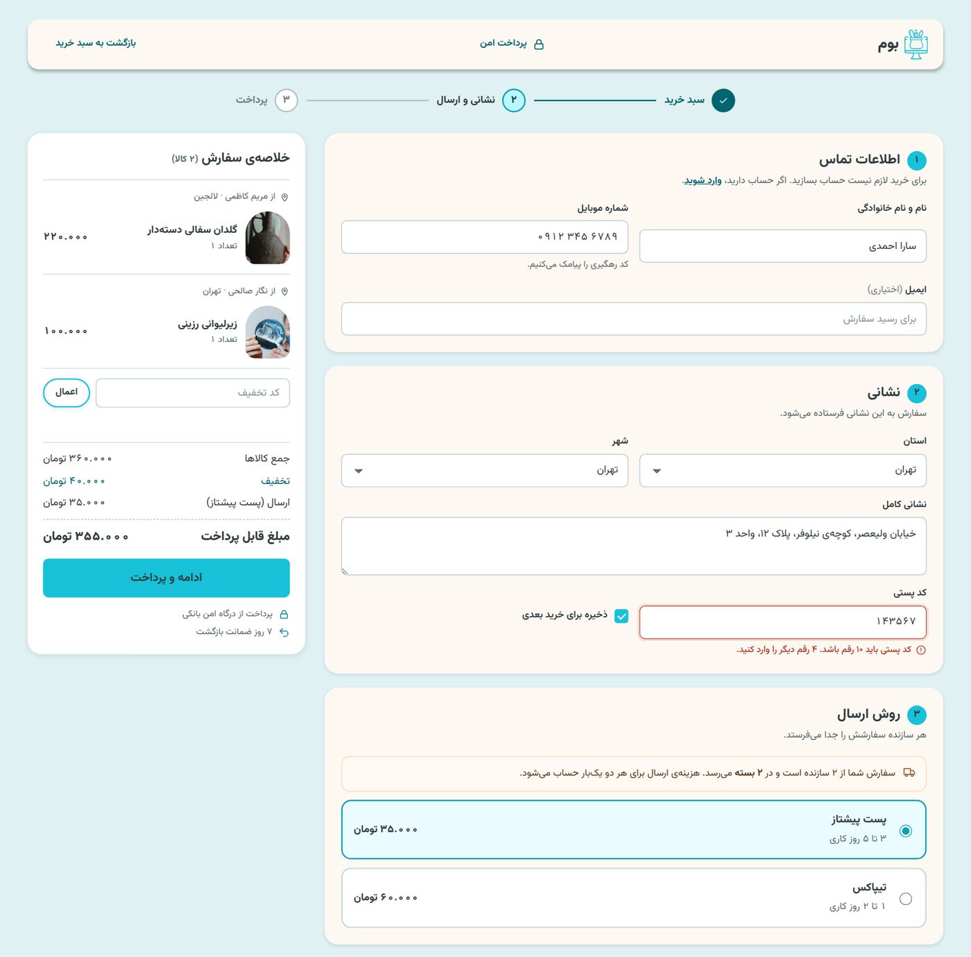 1234
- 1
Three clear steps
Cart, address and delivery, then payment.
- 2
Errors that help
A wrong postcode says what's missing and how to fix it.
- 3
Two makers, two parcels
Each maker posts their own order, so the page says so before you pay.
- 4
Summary grouped by maker
You can see which piece comes from whom.
All the screens
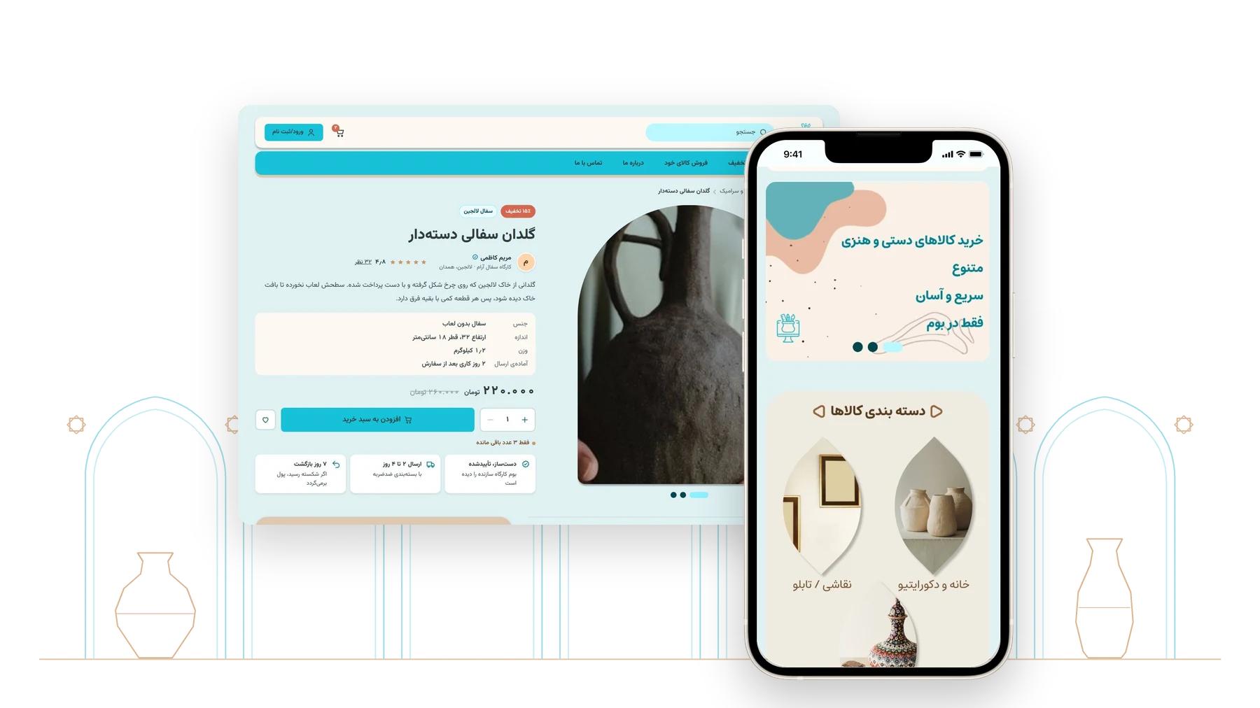
The finished pages, one at a time. The screens are in Persian.
Landing page

Landing page on a phone
Category page
Product page
Maker profile
Checkout
Scroll inside the frame to see the whole page.
Reflection
What's next
Design the two insights I left out, a "picked for you" shelf and eco-friendly packaging at checkout, plus phone versions of the shop pages and Nowruz and Yalda collections. Then test it with people who buy crafts on Instagram and with a few artisans, and check the right-to-left order with a screen reader.